


Conference Stage Screen Design That Works
A stage can have strong presenters, polished content, and a solid show flow, then still fall apart visually because the screens were treated as decor instead of part of the system. Conference stage screen design is not just about making the room look expensive. It determines what the audience can read, what cameras can capture, how the content team builds assets, and how much risk the production crew carries once the room goes live.
That is why screen design decisions need to happen early, before scenic is finalized and long before show files are loaded. In corporate events, the screen package affects everything from IMAG framing to pixel mapping to backup paths. If the design is wrong, no amount of last-minute switching or scaling fixes the underlying problem.
What Conference Stage Screen Design Actually Controls
Most planners first think about size and shape. Those matter, but they are only the visible layer. A screen system controls audience legibility, camera composition, presenter confidence, cueing flexibility, and the complexity of the video signal chain.
A single wide center screen is simple to manage and easy for general sessions with slide-heavy content. A multi-screen layout can create more visual impact, but it also introduces more processing, more content versioning, and more opportunities for mismatch between what is on stage and what is in the stream. LED walls add brightness and design freedom, but they also bring pixel pitch, moire, color calibration, and processor configuration into the conversation.
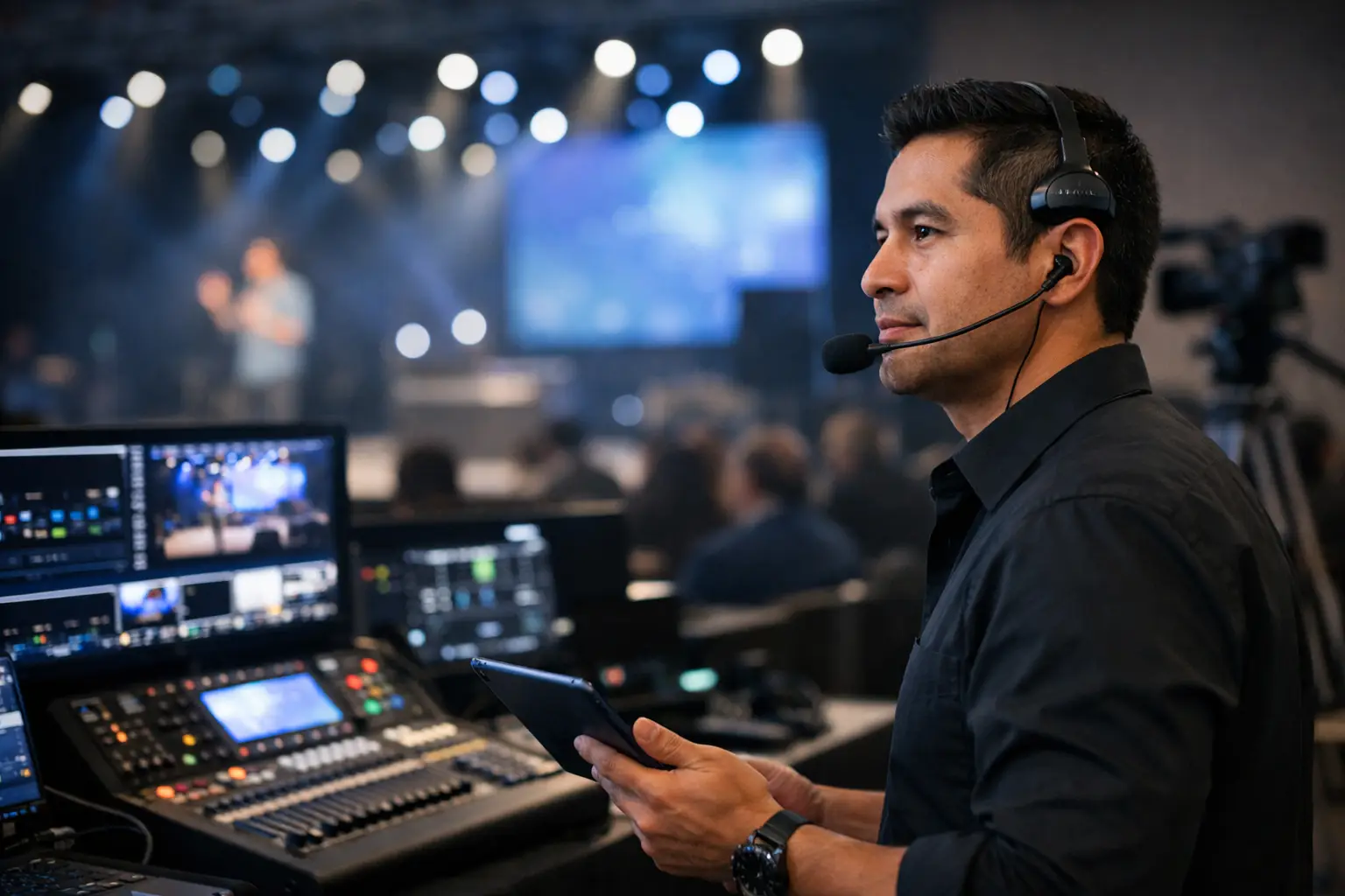
This is where experienced event production planning matters. The screen concept has to work not only for the audience in the room, but for confidence monitors, graphics playback, camera shading, switching, and recording. For larger corporate shows, that usually means approaching the screen layout as part of the full production system, not as a scenic add-on. AV Land handles that through full-service corporate event production with video, lighting, audio, switching, and show operation planned together.
Start With Content, Not Screen Shape
The most common planning mistake is choosing an aggressive screen layout first, then asking the content team to make slides fit later. That backwards workflow creates unreadable type, awkward cropping, and presenter frustration.
Before you lock in screen dimensions, ask what will actually be shown. A CEO keynote with dense slides has different requirements than a product launch with motion backgrounds and short speaker prompts. A medical conference showing detailed charts needs different legibility than a sales kickoff running bold statements and sponsor loops.
If the event relies on PowerPoint or Keynote, your conference stage screen design should respect standard content workflows unless there is a clear reason not to. Ultra-wide canvases can look impressive in renderings, but they often force the content team into custom builds that increase revision time and operator risk. Sometimes the right answer is a standard 16:9 center image with flanking scenic LED accents, because it preserves clean content while still giving the stage scale.
Screen Format Choices and the Trade-Offs
Center Screen Only
A single center screen is still the most dependable option for content-led conferences. It keeps the show file simple, supports straightforward switching, and makes rehearsals more efficient. It also translates well to webcast and recording because the primary visual language is consistent.
The trade-off is obvious. It can feel conservative if the scenic design depends heavily on the screens to create visual energy. That does not make it outdated. It makes it appropriate for many executive presentations where clarity matters more than spectacle.
Dual Screens or Side Screens
Side screens solve a sightline problem in larger rooms and can support branding, agenda elements, or duplicate program feed. They are useful when the venue is wide and the audience extends beyond the ideal viewing angle of a single center display.
The downside is that side screens can clutter the visual field if they are not serving a clear purpose. Mirroring the same content everywhere is not always better. In some rooms, it reduces impact by making the stage feel busy and flattening the composition for cameras.
Wide LED Canvases
A wide LED wall gives designers flexibility with scenic integration, brightness, and unconventional layouts. For modern tech events, it is often the right tool, especially when motion design and brand visuals are a major part of the show.
But wide formats require discipline. If the content team is building for a non-standard raster, they need clear specs early. Playback, switching, and screen management need to be aligned around that canvas. On shows using advanced processing, systems like Barco E2 are often what make those layouts practical because they allow precise screen management, layering, and source control across complex canvases.
For broader reference, Barco Event Master systems are built for rental and staging workflows where high input/output density, low latency, and robust image processing matter. For LED-specific workflows, control systems such as NovaStar are widely used in LED display control, and LED manufacturers such as ROE Visual and Absen provide display products used across rental, staging, corporate, broadcast, and commercial environments.
Conference Stage Screen Design for the Room and the Stream
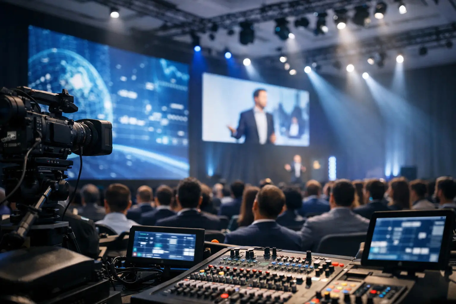
Hybrid and streamed events changed the standard. The room is no longer the only audience that matters. A screen design that looks great from row ten can perform badly on camera.
Bright LED surfaces can overpower presenters if the lighting and camera settings are not tuned properly. Fine pixel pitches can still create artifacts depending on lens choice, distance, and framing. Extremely wide canvases may force awkward crops in the webcast unless a separate stream composition is built.
That is why the screen plan should be reviewed with the video team, not just the scenic team. If the event includes live broadcast, remote speakers, or session capture, the stage screen design should support a camera-first workflow where needed. In practice, that means deciding early whether the stream will follow the room feed, use a dedicated output, or require alternate graphic compositions. For events with meaningful online audiences, livestream planning needs to happen in parallel with screen design, not after it.
Resolution, Pixel Pitch, and Viewing Distance
This is where a lot of expensive mistakes happen. Bigger is not automatically better, and higher resolution is not automatically visible to the audience if the viewing distance does not justify it.
For projection, brightness and lensing matter as much as image size. For LED, pixel pitch has to match audience distance, content detail, and camera needs. A wall that looks acceptable to the back of the room may still look rough on IMAG or in close camera shots. On the other hand, specifying an unnecessarily tight pixel pitch can inflate cost without improving the audience experience.
The right choice depends on the room, the stage depth, the first-row distance, and how the wall will be used. If the screens are carrying detailed spreadsheets, interface demos, or small type, the design tolerance is much tighter than it is for logo loops and abstract motion backgrounds.
Signal Flow Is Part of the Design
Good conference stage screen design accounts for what happens behind the wall. What are the sources? Slides, playback, confidence, lower thirds, walk-in loops, remote callers, live camera feeds, sponsor assets, backup machines? How are they routed, switched, scaled, and recovered if something fails?
This is where a simple-looking stage can still be technically complex. A keynote might need one look in the room, another in the stream, and a third on confidence. If that is the case, the processor and switcher architecture need to be built accordingly.
Redundancy matters most when the event has executive presenters, product reveals, or tightly timed show cues. Backup playback, spare signal paths, and tested output mapping are not luxuries on those shows. They are the difference between a recoverable issue and a visible failure.
For teams that want a broader framework for display planning and live event systems, AVIXA Standards remain a useful technical reference point for professional audiovisual performance, verification, and system expectations.
Common Design Mistakes That Show Up on Site
The first is forcing too much content into a layout that was chosen for appearance. The second is ignoring sightlines from the outer seats. The third is treating the stream as an afterthought. Another frequent problem is underestimating rehearsal time for custom screen compositions, especially when multiple outputs, show looks, and speaker support elements are involved.
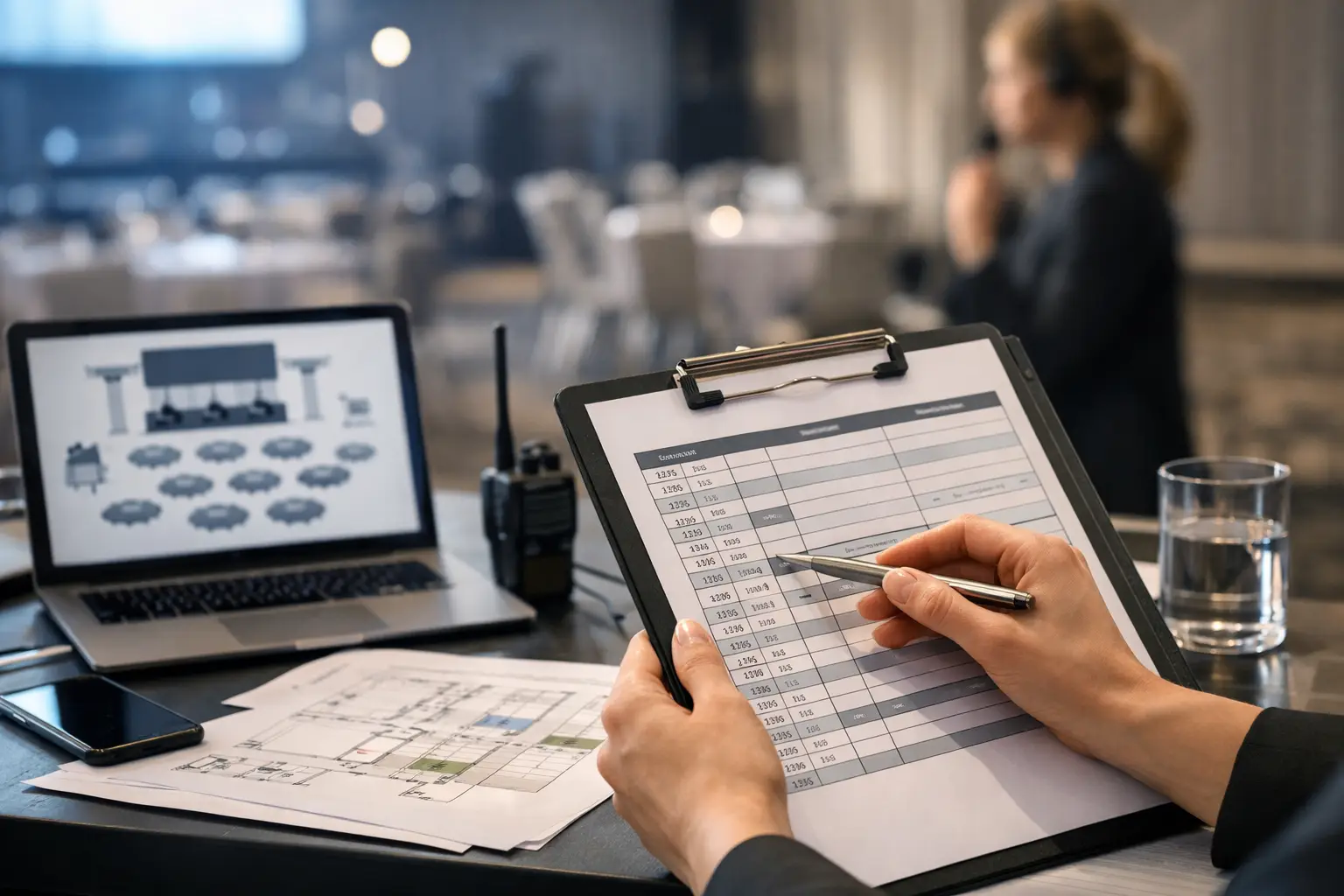
There is also a more basic issue that comes up often in hotels and ballrooms: the physical placement of the screens conflicts with speaker entrances, lighting positions, or PA hangs. On paper, the design looks clean. In the room, it creates blocked views, compromised trim heights, or difficult cable paths. That is why experienced crews prefer to review screen concepts against the actual venue constraints early.
How to Make Better Decisions Earlier
The cleanest projects usually start with four practical questions. What content has to be readable from the farthest useful seat? What does the camera need to see? How many distinct outputs does the show require? And what happens if a primary source fails?
Once those answers are clear, the screen design gets easier. You can choose between projection and LED based on room conditions and use case. You can decide whether a standard format or custom canvas is worth the added complexity. You can align scenic, graphics, switching, and livestream teams around one plan instead of solving conflicts in rehearsal.
For Bay Area corporate events, this is usually where the value of an experienced production partner shows up. The goal is not to oversell a bigger wall. The goal is to build a screen system that supports the content, protects the show, and stays stable under live pressure.
The best stage screens do not call attention to the compromises behind them. They just read clearly, frame well, switch cleanly, and keep doing their job when the room is full and the show clock is running.
AV Land Conference Screen Design Support
AV Land supports conference stage screen design, LED wall planning, projection, screen management, Barco E2 operation, livestreaming, recording, and technical direction for corporate events across the Bay Area.
For conferences, keynotes, product launches, executive meetings, and hybrid events, the screen package should support the content, the room, the camera plan, and the remote audience. AV Land helps plan the screen system as part of the full production workflow, not as an isolated display rental.
Need Help Planning Conference Stage Screens?
AV Land supports Bay Area corporate events with screen design, LED wall support, projection, livestreaming, recording, camera workflows, technical direction, and show-day operation.
Contact AV Land to discuss your next conference, keynote, or general session.
Phone: 415-799-1315
Email: info@av.land
Frequently Asked Questions
What is conference stage screen design?
Conference stage screen design is the planning of screen size, format, placement, content resolution, projection or LED technology, signal flow, and camera compatibility for a live event stage.
Should we use LED walls or projection for a conference stage?
It depends on the room, budget, ambient light, sightlines, content type, and camera plan. LED walls can offer brightness and design flexibility, while projection can still work well in controlled rooms with the right screen size and lensing.
Why does screen design matter for livestreaming?
A screen design that works in the room may not automatically work on camera. Livestreaming requires attention to framing, brightness, legibility, moire, aspect ratio, and whether the stream needs a dedicated output separate from the room screens.
What is pixel pitch?
Pixel pitch is the distance between pixels on an LED wall. Smaller pixel pitch can improve close-viewing sharpness, but the right choice depends on viewing distance, content detail, camera needs, and budget.
Does AV Land support conference screen design across the Bay Area?
Yes. AV Land supports conference screen design, LED wall planning, projection, screen management, livestreaming, and technical direction across San Francisco, San Jose, Santa Clara, Mountain View, Palo Alto, Oakland, and nearby Bay Area cities.